Why Gold Reads as Warm Even in a Cool Room
Why gold reads as warm in a cool room comes down to reflected light and nearby colors; learn what changes its appearance and how to assess a finish.
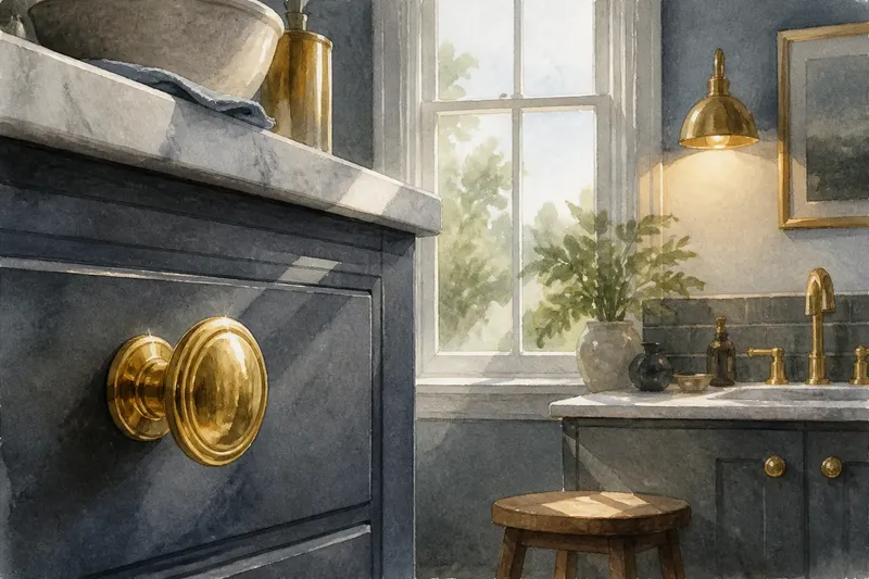
Gold reads as warm in a cool room because its surface sends back light colored by the material itself, even as blue-gray walls and cool daylight shape the rest of the scene. A brass knob against a slate cabinet, for instance, can look like a small ember set into stone. The effect is not a contradiction: the metal and the room contribute different colors to what your eye sees.
That distinction helps explain why a gold finish can feel mellow in one setting and bright, brassy, or almost greenish in another. Its appearance depends on the finish, the light reaching it, the surfaces around it, and the angle from which you look. Gold is not simply a fixed patch of yellow; it is a reflective material participating in a changing visual environment.
What makes gold look warm in the first place?
Color begins with light. When light reaches a gold-colored surface, some wavelengths are absorbed and others are reflected toward your eyes. Gold’s characteristic yellow-orange reflection supplies a warm cue that can remain noticeable beside cool colors.
In a painted object or a gold-toned coating, pigments and surface properties produce a related effect, though the material may not behave like metallic gold. A matte ochre surface tends to return light diffusely, while a polished metallic finish sends sharper reflections that shift as you or the light move. Both may look warm, but they express that warmth differently.
Our perception also depends on comparison. A honey-colored reflection can seem especially warm beside blue-gray, just as the same reflection may seem quieter beside cream or rust. The contrast does not change the metal’s composition; it changes the visual relationship your eye uses to judge its color.
Why does a cool room not make gold look cool?
A cool room often contains several visual signals: gray-blue paint, daylight, stone, glass, or brushed steel. Those surroundings influence the general mood, but they do not erase the color reflected by a gold surface. Instead, the eye reads the warm object against a cooler field, making their difference conspicuous.
Light from a window can make the distinction more complex. Overcast daylight may cast a cool impression across the room, while the gold finish still returns a warmer band of reflected color. Near a window, the finish can also pick up pale sky, a neighboring wall, or a bright patch of glass. The result is a mixture: a recognizably warm base with cooler reflections sliding across it.
Artificial light changes the balance again. A warm lamp may deepen amber notes, while a cool-toned bulb can make highlights look paler or more silvery. Neither setting makes every gold object look the same, because the finish’s texture and the objects reflected in it remain part of the scene.
How do nearby colors alter the same gold finish?
Adjacent colors affect gold through contrast and reflection. A blue or charcoal backdrop can make its yellow-orange hue stand out. Cream, tan, and warm wood may blend more gently with it, while a strongly saturated red can lend the whole arrangement a richer, more dramatic cast.
Reflective finishes bring nearby colors into the surface itself. A polished gold frame beside a green wall may catch a greenish stripe along its edge; brushed gold may show a broader, softer shift. Matte gold-colored paint usually reflects less of the room in recognizable patches, so its appearance depends more on its own color and the light falling on it.
Imagine a homeowner choosing a gold cabinet pull for a room with blue-gray tile. If the pull is polished, it may mirror the tile and a nearby window, creating cool streaks across a warm center. If the homeowner chooses a brushed finish instead, the tile may appear as a muted tint rather than a sharp reflection, and the pull may read as more consistently warm. The visible difference is a likely result, not a fixed rule: the light and viewing angle still matter.
What does the finish contribute?
Finish controls how concentrated or dispersed reflections appear. Polished surfaces produce crisp highlights and can reflect recognizable shapes; brushed surfaces break reflections into softer bands; satin finishes sit between those visual extremes. A textured or hammered surface creates many small changes in direction, so its brightness can seem lively without presenting one continuous mirror image.
These differences influence perceived warmth. A sharp white highlight on polished gold may look nearly neutral beside the deeper yellow areas. On a brushed surface, the color can appear steadier because the highlights are spread across the grain. A dark, low-gloss surface may look more subdued, with its warm color emerging chiefly where light reaches it.
Gold-colored materials also vary in their underlying hue. Some lean toward pale champagne, others toward orange, copper, or muted beige. A finish with a faint green cast may feel cooler than a saturated yellow-gold, particularly against warm wood. Names such as “brushed gold” or “antique brass” can suggest a look, but they do not fully describe the color or reflectivity of a particular product.
How can you judge gold in its intended setting?
Assess the finish where it will actually appear, rather than relying only on a small sample under store lighting. Hold the sample beside the wall color, tile, fabric, or wood that will sit near it. Then view it in the room’s daylight and under its usual lamps. The aim is not to find one universal “true” gold, but to see how the object behaves among its intended neighbors.
Pay attention to the reflected shapes as well as the base color. A polished sample may pick up a dark doorway or bright window, making its overall appearance seem more varied than a product image suggests. Move it slightly and watch whether the surface keeps a warm impression or shifts sharply with the reflected scene.
- Compare the finish directly with the room’s dominant wall or cabinet color.
- Look at it under both window light and the room’s regular artificial light.
- Check whether the sample is polished, brushed, satin, or matte.
- Notice if nearby objects create strong colored reflections on its surface.
- Judge the finish from the distance and angle at which the object will usually be seen.
If the intended effect is a steady warm accent, a softer, less mirror-like finish may suit a visually busy room. If you want the metal to echo the room’s changing colors, a shinier surface can make those relationships more visible.
Which questions help explain gold’s changing appearance?
Does cool daylight turn gold silver?
Cool daylight can add pale or bluish reflections, especially on a polished surface, but it does not automatically remove gold’s warm color. The finish may show both at once: a cool highlight over a warmer body.
Why does gold look brighter beside blue?
Blue and yellow-orange are visually contrasting colors, so each can make the other more noticeable. The gold may seem more vivid against blue even when the light and finish have not changed.
Can brushed gold look warmer than polished gold?
It can, because brushed texture softens distinct reflections and may let the surface’s underlying hue read more consistently. But a polished finish can also look richly warm when it reflects amber light or warm-colored surroundings.
Is champagne gold a warm or cool finish?
Champagne gold often appears pale and restrained, but its impression depends on the exact hue, sheen, and surroundings. Beside cool gray it may look warmer; beside orange-toned wood it may appear more subdued.
What is the useful way to think about gold?
Think of gold as a warm color carried by a reflective surface, not as a fixed color chip that stays unchanged in every room. The base hue gives the material its recognizable character; the finish and surroundings determine how much that character is softened, sharpened, or mixed with reflected color.
For a design decision, compare the actual finish with the surfaces and lighting it will meet. That small act makes the phrase “warm gold” more precise: it tells you not only what the material looks like by itself, but how it is likely to speak alongside the cool colors already in the room.